Evocative Typography
Year
2026
This is a project assigned in my second semester of college.
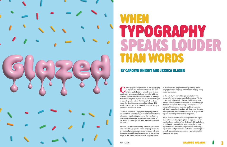
I designed a double spread from the prompt: Glazed. The goal of this assignment was to evocatively display the word and layout the text.


Moodboard

Glazed (adj):
1. Covered or coated with a smooth, shiny finish
2. To fit panes of glass into
3. Showing no interest or animation (expression)
The first thing I did when assigned this word was review all dictionary definitions. I was drawn to the first definition since that's quite evocative in and of itself. I was immediately imagining pottery and doughnuts.
Sketches
I made a few sketches for the title page with these two themes in mind. Since the objective of this assignment was to make the type evocative, I leaned into a drippy, glossy design.

Layouts
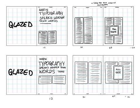

The assignment required the layout include folios, a header or footer, and a pull quote. Keeping this in mind, I laid my text out on a grid. While creating these layouts, I accounted for margin and gutter space, line length around the pull quote, and effective use of white space.
Font Exploration

When exploring fonts, I wanted to keep the tone friendly and fun. For the title, I was specifically looking for round terminals and soft slabs. For the body, I was specifically focusing on readability and contrast.
Once I narrowed down the typefaces, I set the copy. This allowed me to adjust font size, kerning, and weight in a way that makes sense with the provided copy. It also made it easy to compare my options. Looking at it like this, the choice was obvious.
Final